
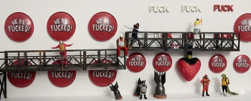
Sarr
I am a Paris-born artist whose journey began with graffiti on concrete walls and a thirty-year detour through the corporate world. After years of exploring photography, painting, and epoxy, I found my true voice in the creation of shadow boxes and miniatures.
Now based in New York City, I build intricate, tiny worlds where workers hang from wires and words carry weight. My work doesn't aim to provide answers; instead, it explores the fragile "in-betweens" of life, capturing the tension between objects and ideas within the confines of a frame. I create because I am often as much a part of these boxes as the figures I place inside them.
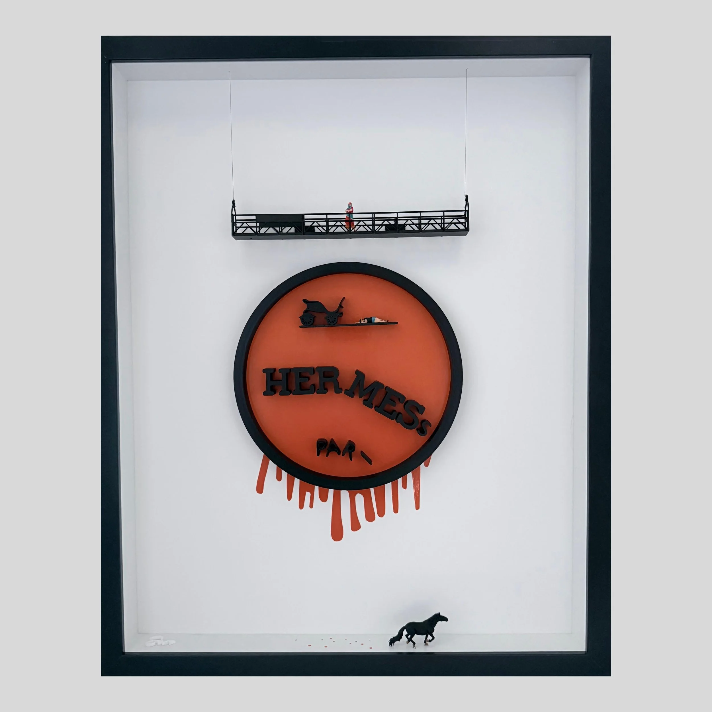
Original art. Mixed media
Measures: 16×20
I kept the original structure of the Hermès logo because I didn’t want to parody it. I wanted to disturb it without destroying it.
The circle remains intact — a symbol of legacy, exclusivity, containment. The orange stays loud and luxurious. At first glance, everything feels familiar. Then something shifts.
The horse, the figure of movement and power, is removed from its dominant position and placed at the bottom of the frame. It’s no longer leading. It’s grounded. Almost fallen. The carriage remains above — a structure without propulsion.
And the letters don’t stand proudly anymore. They fall inward. They lose balance. “Hermès” becomes “her mess” not through aggression, but through gravity.
This piece came from thinking about perfection — how it’s constructed, marketed, and expected. Especially from women. The demand to appear composed, elegant, unshakeable. The logo represents that polished exterior. But when you slightly shift power, slightly disrupt hierarchy, the whole system feels unstable.
The mess was always there. It was just hidden inside the circle.
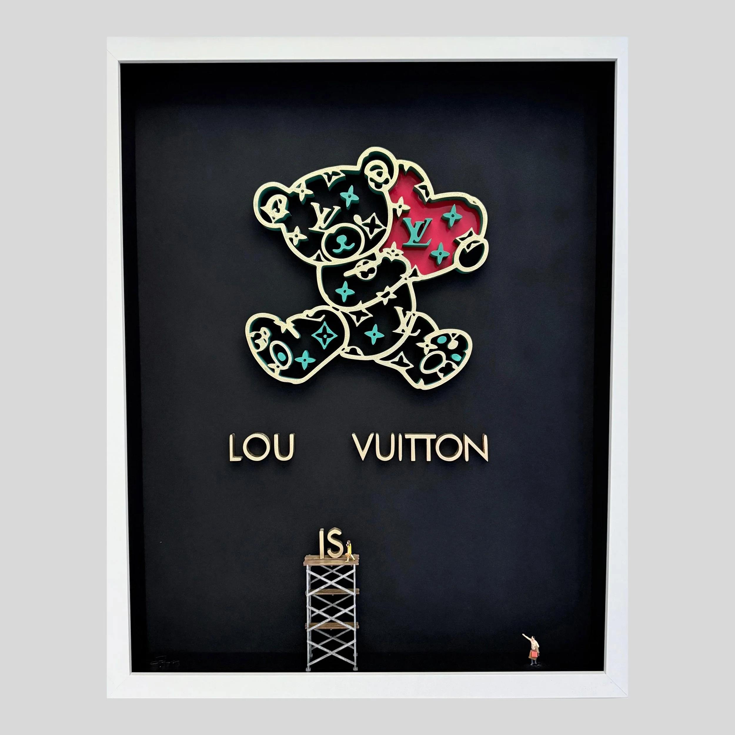
Original art. Mixed media
Measures: 16×20
Everything remains intact. The codes, the name, the sense of value. At first, it feels universal. Like it belongs to everyone in the same way. Then that assumption starts to slip.
The name no longer holds as one. “Louis” becomes “Lou is.” A quiet break that doesn’t announce itself, but changes how it’s read. Not everyone sees it the same way.
This piece came from thinking about the distance between childhood and adulthood — how recognition evolves, and what gets lost in the process. How something can exist in two completely different ways at the same time.
For a child, meaning is immediate. It doesn’t need context. It doesn’t rely on language. There’s no hierarchy, no constructed value. Just a direct, emotional understanding.
For an adult, that same moment becomes filtered. Interpreted. Tied to knowledge, status, memory. What was once simple becomes layered, and heavier.
Nothing about the system itself changes. The name, the structure, the identity all remain stable.
One sees what it is the other sees what it means.
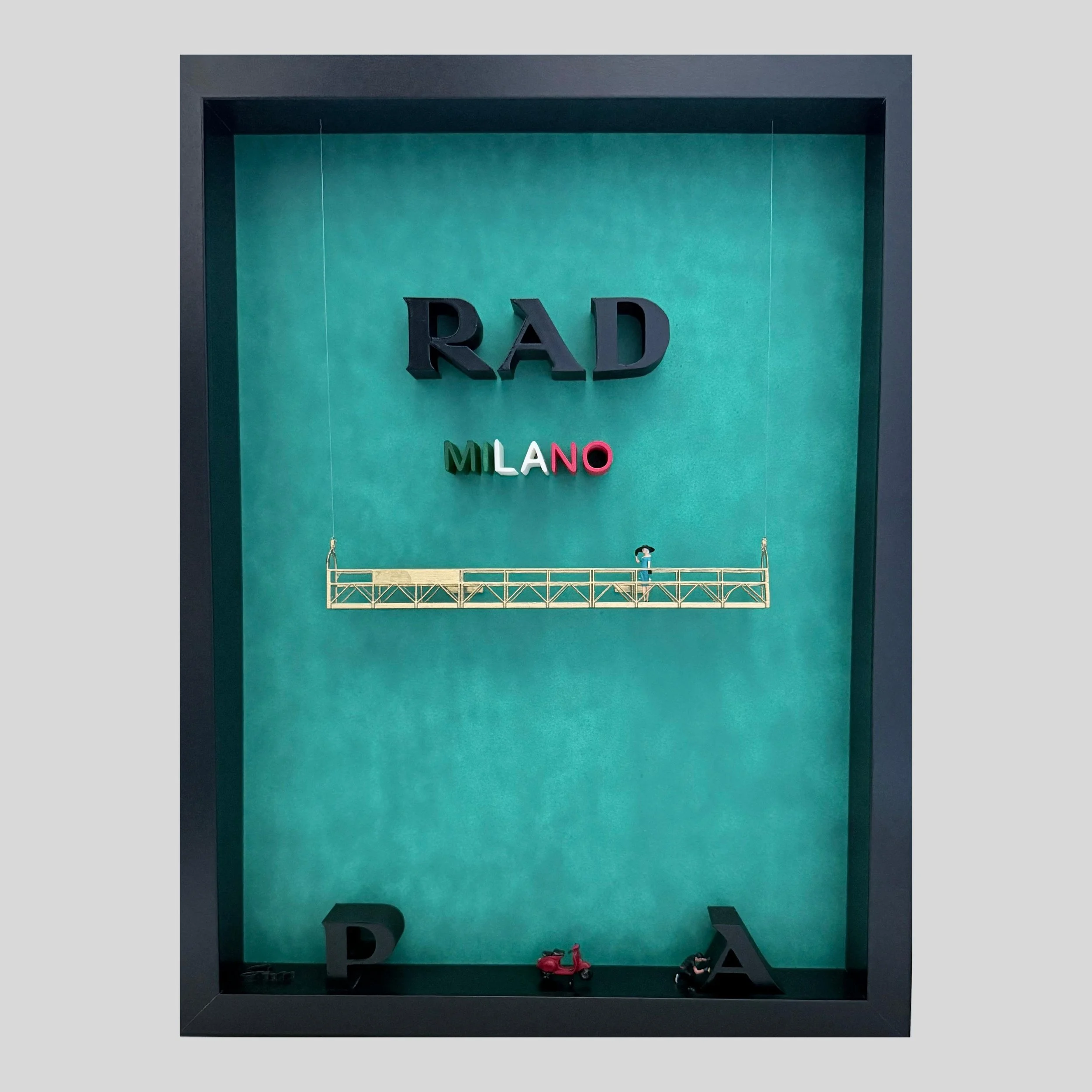
Original art. Mixed media
Measures: 12x16
There is something about Italy that does not separate fashion from life, or beauty from movement. It exists as atmosphere — lived, shared, and continuously reinterpreted.
Luxury here is not distance. It is presence.
Not what is displayed, but what is carried forward by culture, by city, by people.
“RAD” is not an end or a fragment, but a reading of energy — immediate, confident, alive.
What surrounds it is not support, but context: a reminder that meaning is never isolated, never fixed, always in circulation between history, place, and those who engage with it.
And in that circulation, nothing is ever truly missing.
Only continuously re-made.
Original art. Mixed media
Measures: 12x16
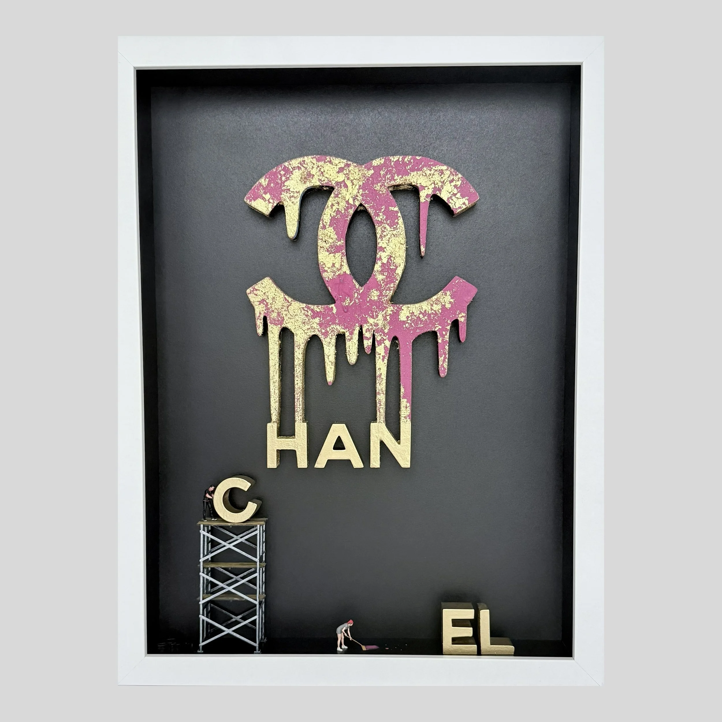
This isn’t luxury finished. This is luxury in the making.
Not the polished window. Not the final glow under boutique lights.
Because glamour doesn’t arrive perfect. It’s installed. Adjusted.
Swept clean after the mess it took to build it. The gold drips like success before it hardens, loud, messy, a little excessive.
Pink stains the ground like proof that beauty is never as effortless as it pretends to be.
Some letters stand tall. Some are still waiting. Some haven’t been lifted yet.
Just like every dream that ever tried to spell its own name.
Chanel here isn’t a brand. It’s a moment. The second before the lights turn on.
The second before the world believes it was always this way.
Because even icons have to be built one letter at a time.
Original art. Mixed media
Measures: 16x20
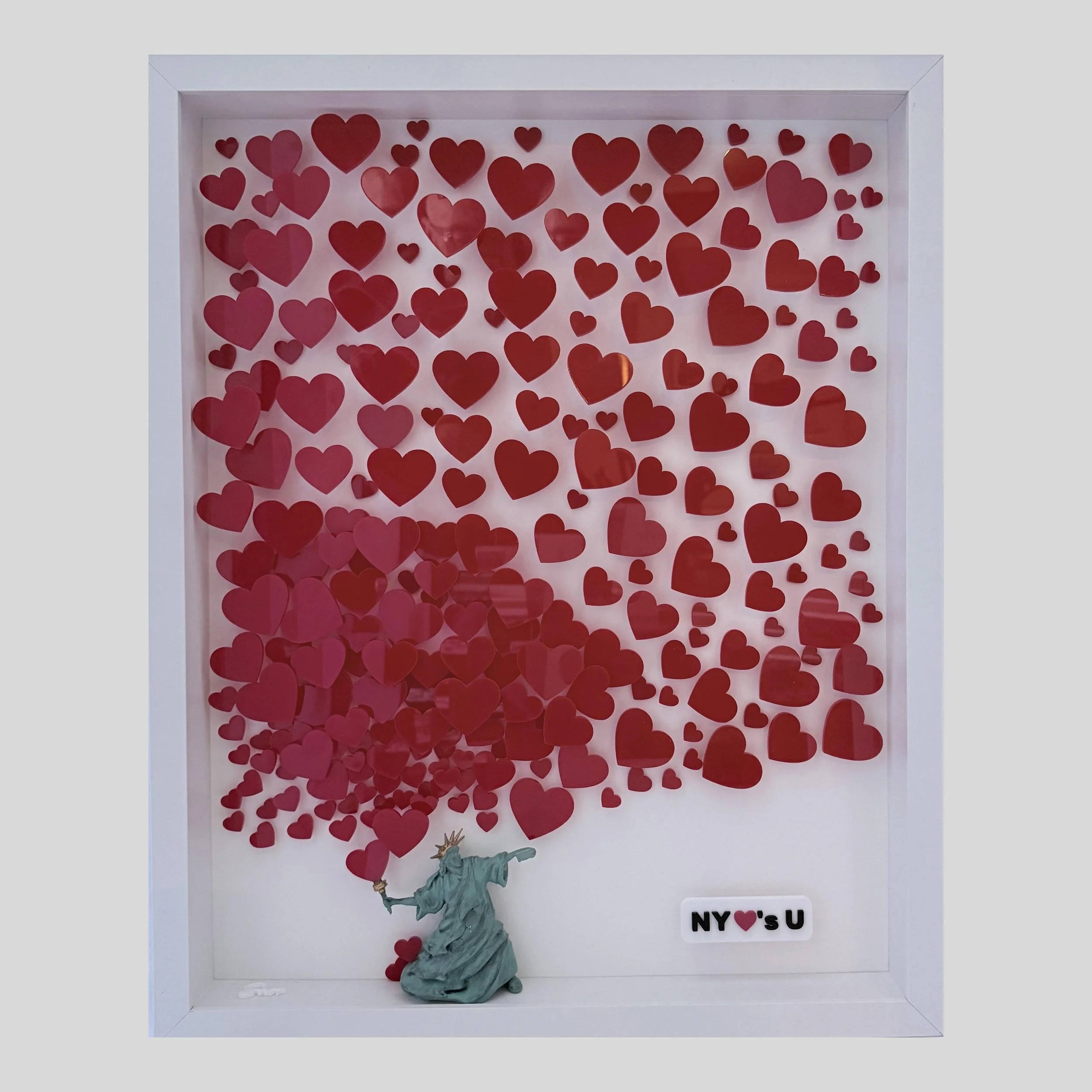
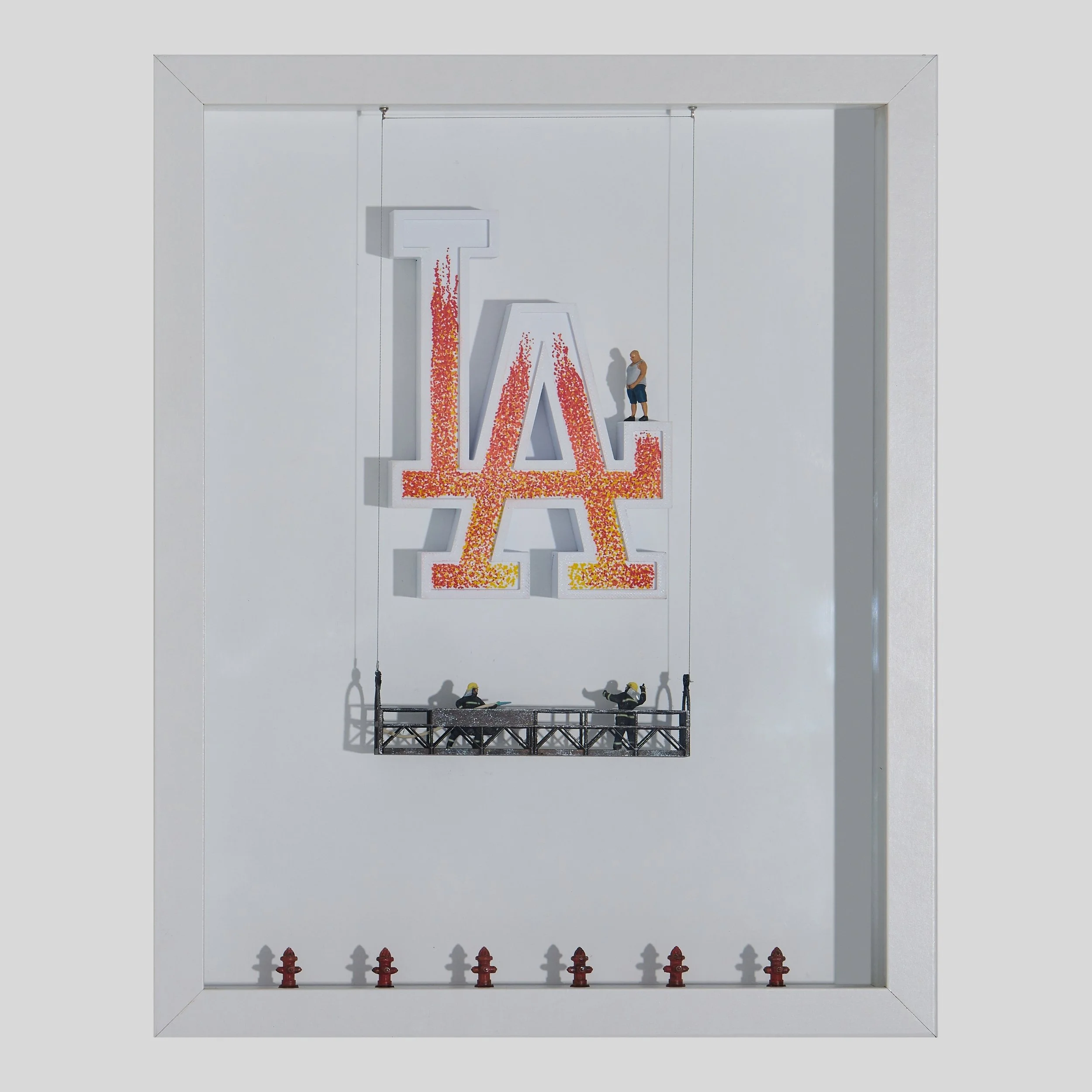
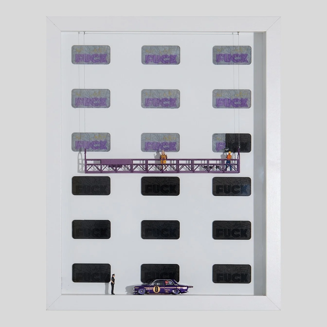
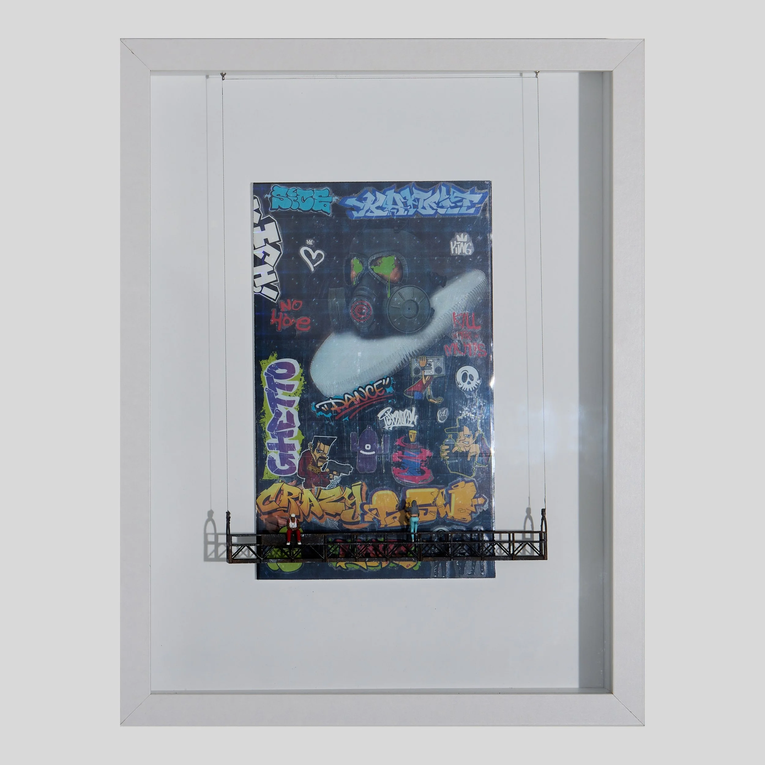
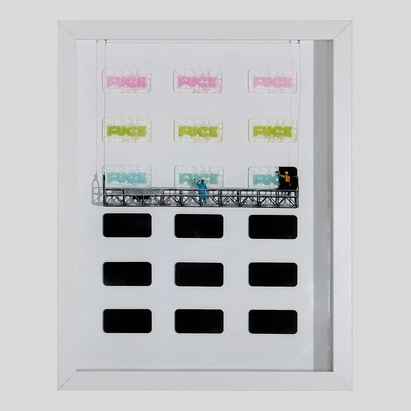
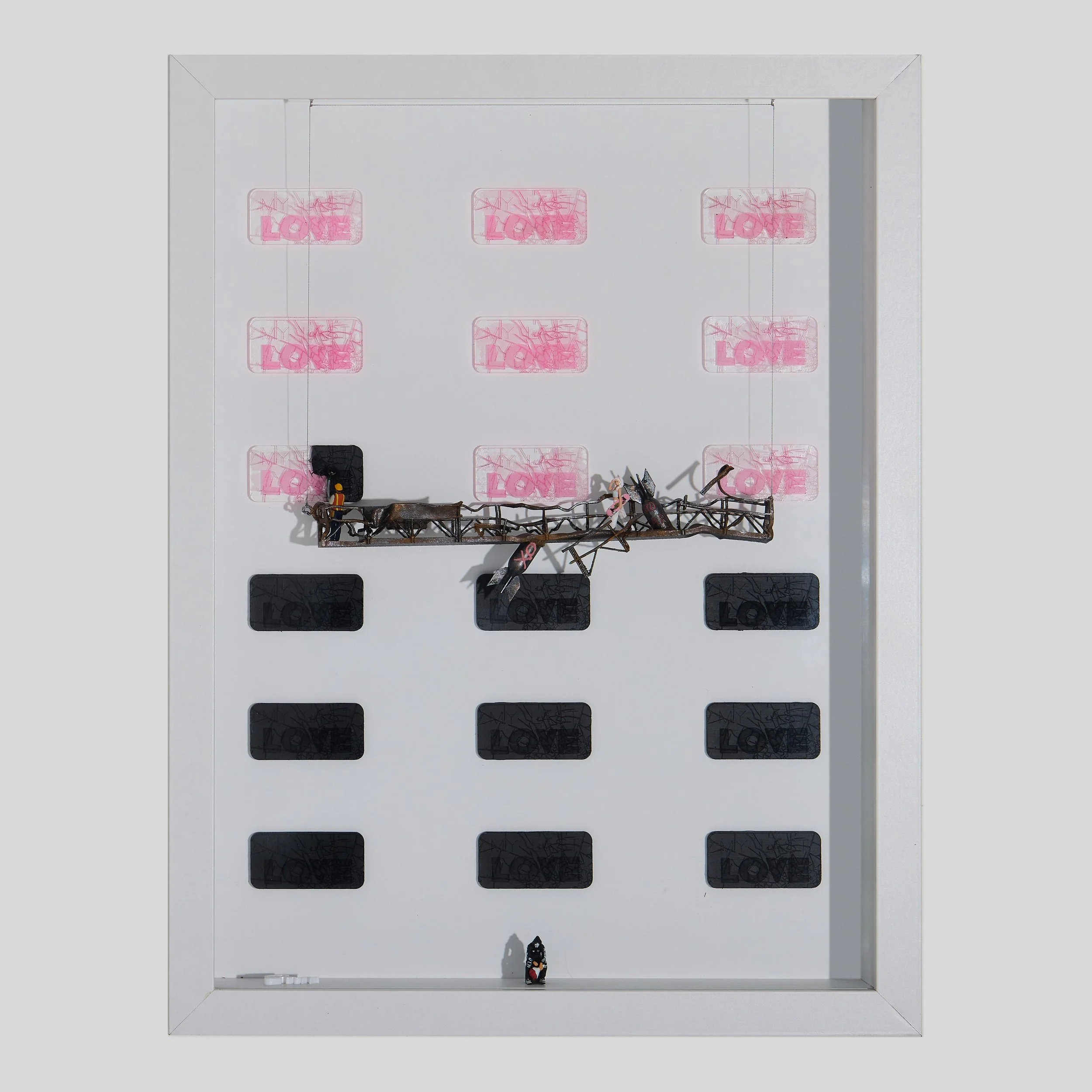
It’s loud love. Big love. Skyline-sized love.
The kind that doesn’t text back “maybe.” It shows up at your door at 3AM with music still playing.
New York loves you in capital letters, in sirens and subways, in corner delis and rooftop nights, in the way the lights stay on — for you.
It loves your ambition, Your chaos, Your accent, Your comeback story.
This is not soft-focus love. This is survive-the-winter, build-it-again, dance-in-the-street love.
The city sees you trying. Sees you arriving. Sees you becoming.
And instead of standing still — it throws it back at you.
All of it. Extra. Unapologetic. Endless.
NY doesn’t fall in love quietly. It loves you out loud
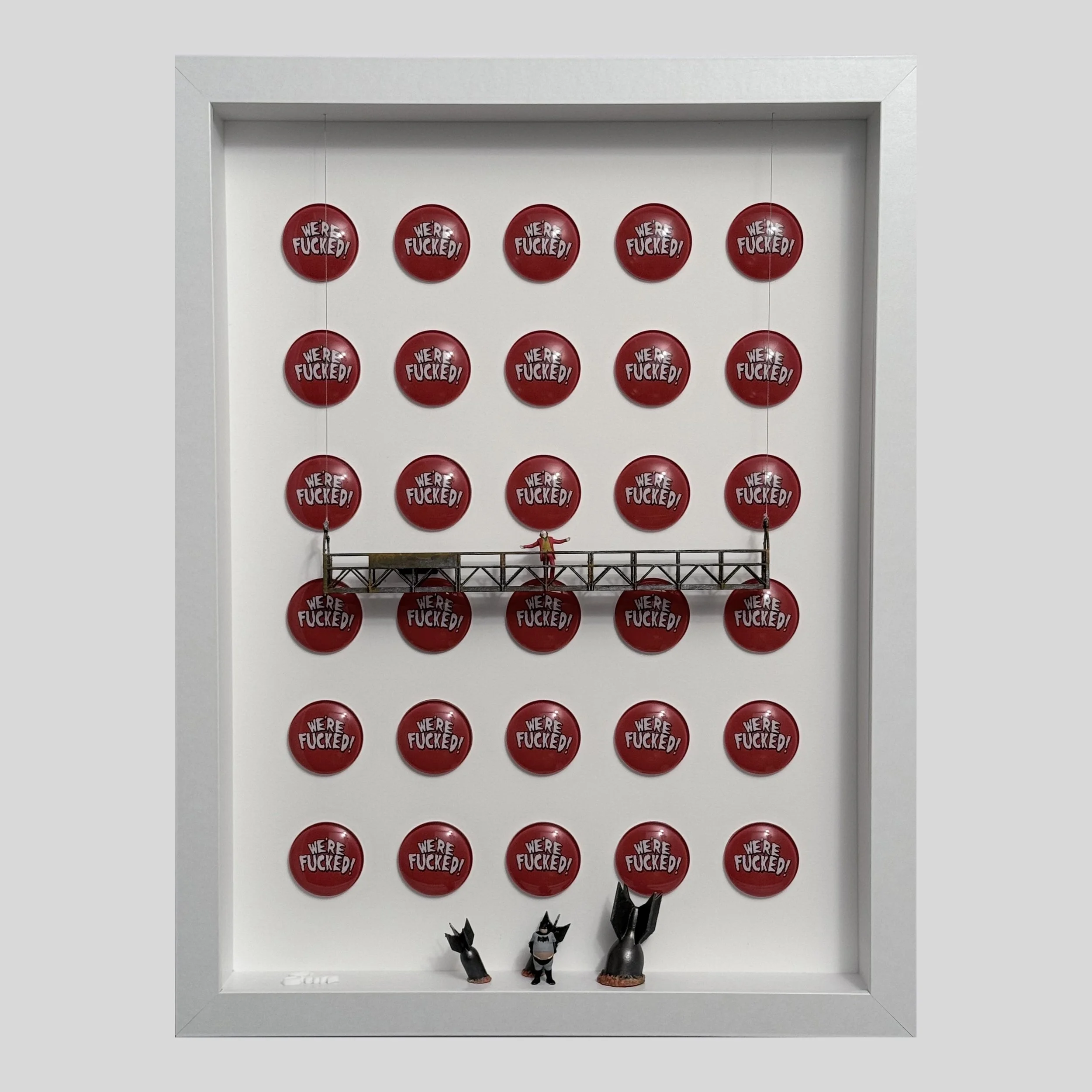
Original art. Mixed media
Measures: 16×20
Everything still feels in place. The scale, the authority, the familiarity of the name. At first glance, it reads as something complete. Self-contained.
Then the center shifts.
The name doesn’t fully resolve. What remains visible is “UCC.” The rest exists, but waits. Not absent — just dependent. As if the identity can’t fully form on its own.
This piece came from thinking about User Created Content — not as a trend, but as a foundation. How what we recognize, desire, and elevate is constantly shaped by the people engaging with it.
Luxury presents itself as origin. As if meaning starts there. But it doesn’t.
It’s built in circulation. In repetition. In the way people wear it, share it, frame it, and give it relevance beyond what was originally made.
The brand holds the structure. But the substance comes from somewhere else. What looks established is actually sustained. And at the center of it — quietly, constantly — is us.