
How Does Color Change the Way a Room Feels?
Walk into two rooms with the same furniture, the same lighting and the same layout, and they can still feel completely different. Sometimes the difference is color. A room with a predominantly blue painting may feel very different from one with a bright yellow artwork. A large red composition can become the first thing you notice, while a softer pink piece might change the atmosphere without demanding the same attention.
But color is not a formula. Blue does not automatically make a room peaceful. Red does not always make it exciting. And pink does not necessarily make a space romantic. The way we respond to color depends on its intensity, the colors surrounding it, the light in the room and our own experiences. That is what makes choosing art by color so interesting. You are not simply choosing something that matches the furniture.
You are choosing something you will experience every day.
Yellow: A Little Light Can Change Everything
Yellow is one of those colors that rarely goes unnoticed. It can suggest sunlight, warmth, optimism and movement. But there is a considerable difference between a soft buttery yellow and an intense, saturated one. A predominantly yellow artwork can brighten the visual character of a room, particularly when the surrounding palette is restrained. It can also create contrast with cooler colors, such as blue or gray.
The important question is not whether yellow is a happy color. It is how much visual energy you want the artwork to introduce.
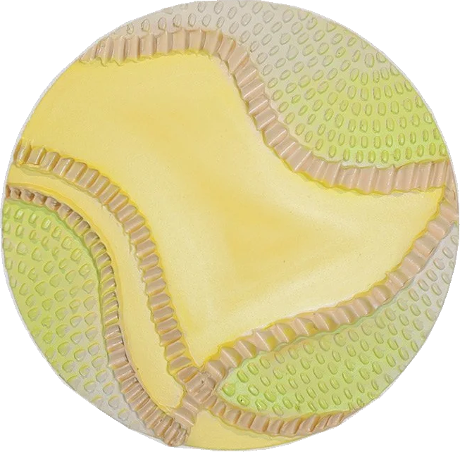
Look at how the yellow operates within the composition. Is it expansive or concentrated? Does it dominate the image or allow quieter elements to balance it? Those relationships matter more than the color name itself.
Orange: Warmth Without Being Quiet
Orange shares some of yellow's brightness and red's intensity, but it has a character of its own. It can bring warmth to a space without relying on a traditional neutral palette. In a room with wood, stone or natural materials, orange may reinforce the warmth already present. Against cooler surroundings, it can become a strong focal point. A vivid orange artwork is not necessarily the right choice for every room. But when it works, it can make a space feel considerably more alive.
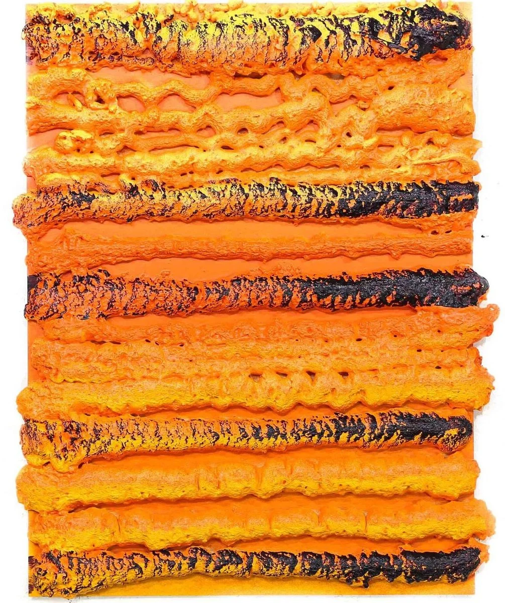
The most interesting thing about orange is that it can be both familiar and unexpected. We recognize it in sunsets, autumn leaves and natural materials, yet a large orange artwork can feel remarkably contemporary.
Red: Presence, Intensity and Attention
Red can be one of the most visually assertive colors in a composition. Even a relatively small area of saturated red can attract attention. That does not mean every red painting creates the same emotional response. A deep burgundy may feel restrained and sophisticated. A bright scarlet can be energetic. A red mixed with warmer orange tones may feel entirely different from a cooler crimson.
Scale also matters. A small red artwork can provide a focused accent, while a large predominantly red painting can influence the visual character of an entire room.
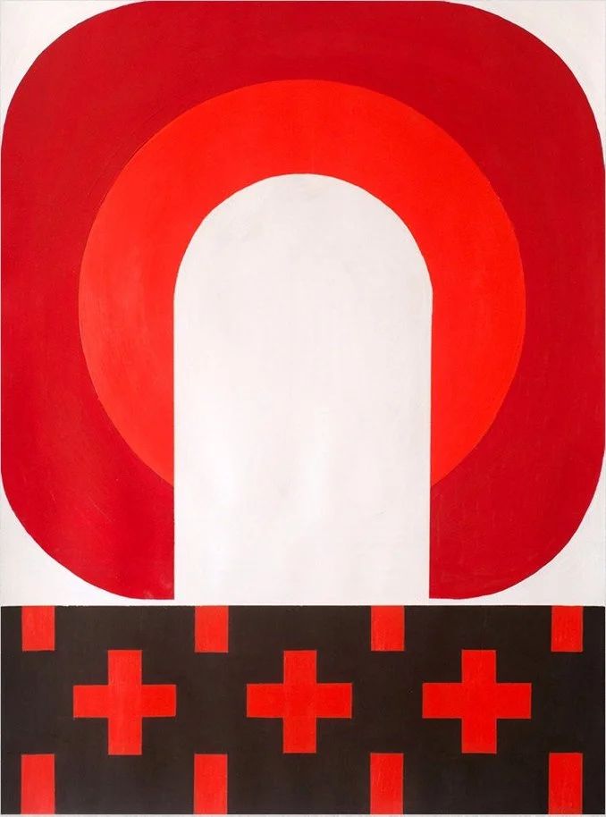
Rather than asking whether red is too strong, consider how the particular artwork uses it. Does the composition offer places for your eye to rest? Does it create movement? Does it work with the other colors in the room, or deliberately challenge them? A powerful color does not have to overwhelm a space. Sometimes it gives the space exactly what it was missing.
Pink: More Versatile Than We Think
Pink is often associated with softness, romance or femininity. But those associations describe only a small part of what the color can do. A pale blush can be subtle. A dusty rose can feel earthy. A saturated fuchsia can be almost electric. Pink can also work surprisingly well with black, dark green, burgundy and warm neutrals. The result depends on the artwork, not on the stereotype.
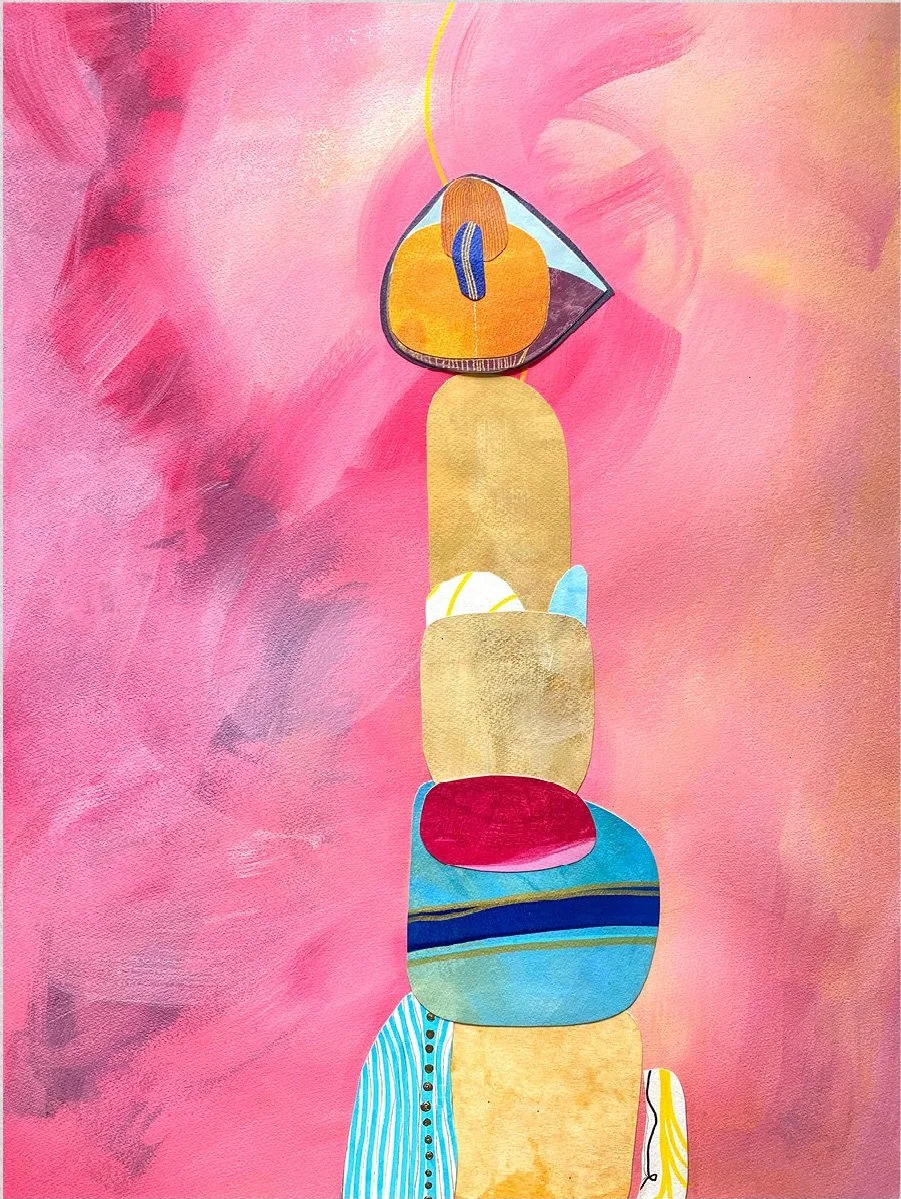
When choosing pink art, I would pay particular attention to its undertones. Some pinks lean toward peach or coral. Others have cooler violet or blue influences. Those differences can change how the painting interacts with the room. There is no reason pink should be limited to a bedroom or a particular decorative style. It can be just as effective in a dining room, hallway or contemporary living space.
Purple: Somewhere Between Calm and Drama
Purple is especially interesting because it sits between the associations we often make with blue and red. Depending on its tone, it can feel quiet, mysterious, dramatic or playful. Lavender and pale violet can create a softer visual impression. Deep plum or saturated purple can have a much stronger presence. But a photograph with purple tones may also communicate something through its subject, light and composition.

This is why it is useful to look beyond the color itself. How does the purple interact with the landscape? What does it do to the atmosphere of the image? Would the same scene feel different if its colors were more neutral? Color can influence not only how we see an artwork, but how we imagine the place or moment it represents.
Blue: Not Every Blue Is Peaceful
Blue is frequently described as calming. Sometimes it is. A pale blue landscape may suggest openness and quiet. A deep navy can create a sense of depth. An intense electric blue can be anything but restful. That is why choosing blue artwork simply because you want a calm room can be misleading.
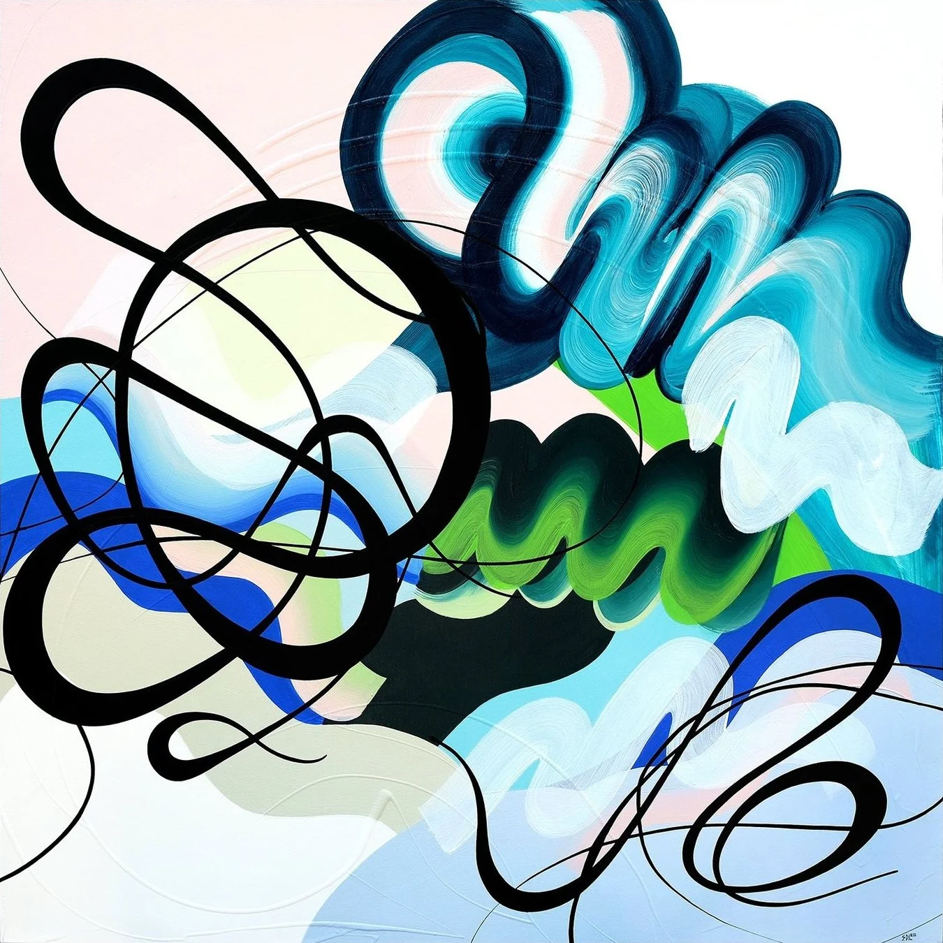
Consider the difference between a painting that uses blue as an open field of color and one that uses it through dense, energetic brushwork. Both may be predominantly blue, but the experience can be completely different. When looking at blue art, pay attention to the movement, contrast and density of the composition. The emotional effect comes from the whole artwork. Not just the pigment.
Green: Bringing the Outside In, Without Painting a Landscape
Green has strong associations with nature, growth and renewal. But a green artwork does not need to represent trees, leaves or a garden to create those associations. An abstract composition can use green in ways that feel organic, architectural or completely unexpected. A deep forest green may give a room visual weight. A brighter green can introduce freshness and energy. Softer sage tones can feel more restrained.

The relationship between green and other colors is particularly important. Green beside yellow can feel vibrant. Green beside blue may feel cooler. Green with black or darker neutrals can become dramatic. Instead of treating green as a single mood, look at the actual palette of the work. That is where its personality becomes visible.
The Same Color Can Feel Different in Different Rooms
There is another factor we sometimes overlook. The room changes the artwork, too. Natural daylight can make colors appear different throughout the day. Warm artificial lighting may alter the way we perceive blues, reds and greens. The color of the surrounding walls also matters. A painting displayed against white can feel different when placed against charcoal, beige or a saturated wall color. And the same artwork can appear more energetic or more restrained depending on the furniture and materials around it.
This is one reason photographs and online previews are useful starting points, but not perfect substitutes for seeing original art in person. The screen shows you an image. The room creates a relationship.
Should Art Match the Room or Challenge It?
This is probably the most useful question when choosing art by color. There are two approaches, and neither is automatically better. One is harmony. You select an artwork whose palette relates to colors already present in the space. The other is contrast. You choose something that introduces a different color, creating a new focal point. A blue painting can work beautifully in a blue room.
But a predominantly orange painting might create an equally compelling result. It depends on whether you want the artwork to blend into the visual rhythm or interrupt it. Personally, I would not begin by asking whether a painting matches the sofa. I would begin by asking whether I want to keep looking at it. Furniture and wall colors can change. An original artwork should be something you enjoy living with beyond a particular decorating decision.
A Note From the Gallery
Color is often one of the first things people respond to when they walk into J. Nunez Gallery. Someone may immediately be drawn to blue. Someone else may love a painting full of red or yellow. And sometimes a person discovers that a color they would never have chosen for their home becomes the reason they love a particular artwork. That is what makes looking at original art so personal.
There are no rules saying that blue belongs in a bedroom, green in a living room or red in a dining room. Those are starting points, not instructions. What matters is how you respond to the actual work and how you feel about living with it. The right color is not necessarily the one that matches everything around it. Sometimes it is the one that makes you look at the room differently.