
What Happens When Light Becomes Part of the Artwork?
Some artworks seem to glow even when there is no light coming from them. A bright line against a dark background can look almost illuminated. An intense color can appear to vibrate. A reflective surface can change dramatically as you move around it. And then there are artworks that actually produce light. Neon, LEDs and other illuminated materials have given artists another way to work, transforming light from something that reveals an artwork into something that can become part of the artwork itself.
But these are not all the same experience. Some artists use color to suggest light. Others work with reflection, contrast or materials that react to their surroundings. And some incorporate actual light sources. Understanding those differences changes how we look at contemporary art.
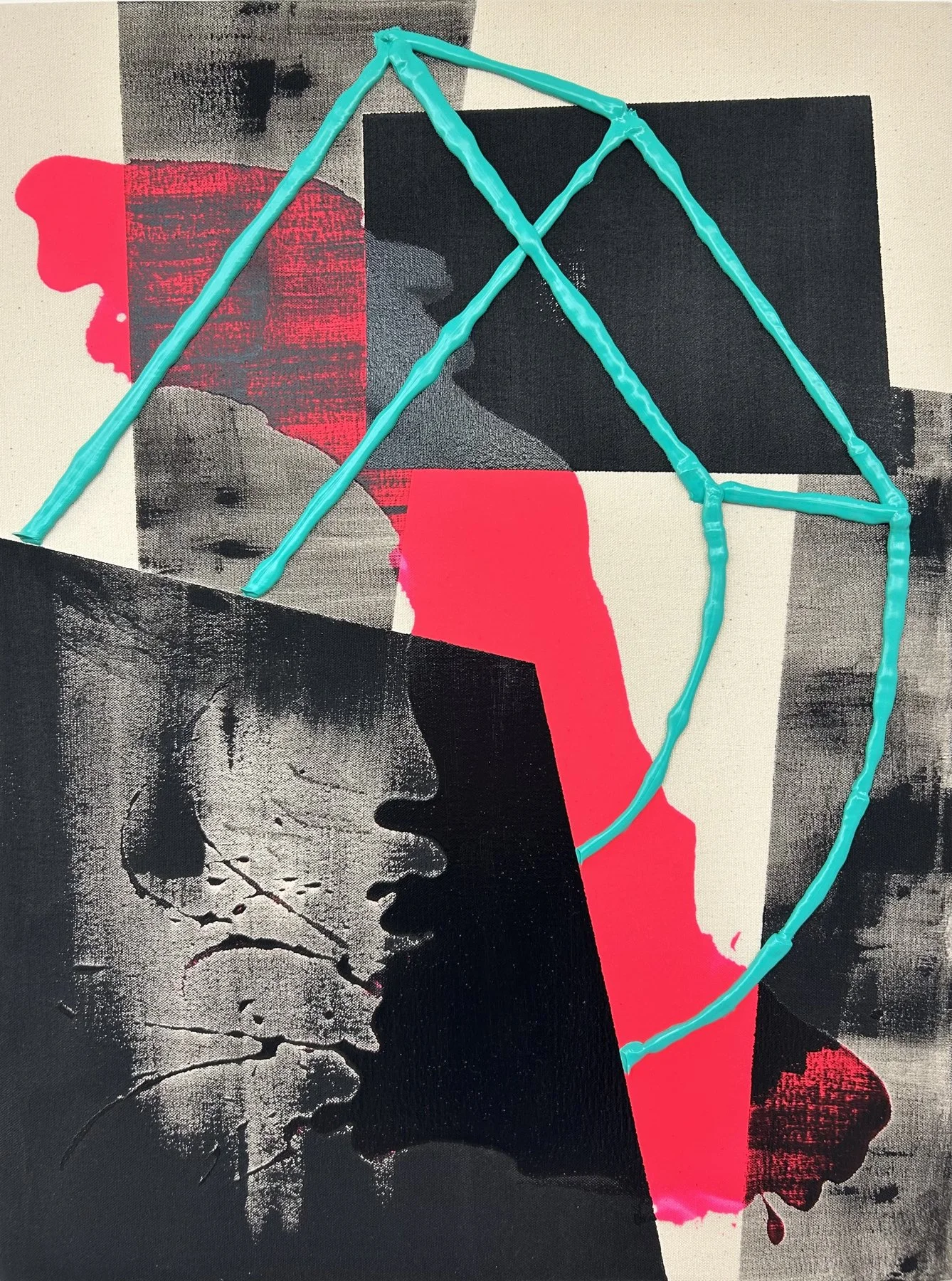
When Color Looks Like Light
Think about a bright turquoise line against a dark surface. Your eye notices it immediately. Now imagine the same line surrounded by several equally bright colors. Its impact may change completely. Color is never experienced in isolation. The colors surrounding it influence how we perceive it. In Félix Aarts's Nebula 4, vivid lines and saturated colors interact with darker areas of the composition. The contrast creates a sense of movement and visual intensity. Some elements seem to advance while others recede.
The work can feel luminous without actually producing light. That distinction is important. An artwork does not need electricity to create the impression of illumination.
What Makes Neon Different?
Traditional neon is not simply a particularly bright color. It is a form of light produced when electricity excites gas inside a sealed glass tube. The resulting glow can become part of an artwork's physical presence. Unlike a painted line, an illuminated line can cast light onto the surrounding wall. The artwork begins to affect the space around it. Neon also carries cultural associations. For decades, it has been part of city streets, advertising, nightlife and commercial signage.
Artists have taken that familiar visual language and used it in very different ways, sometimes through actual illuminated materials and sometimes through paintings that recall its intensity. That distinction matters because the appearance of neon and the physical use of neon are not interchangeable.
When an Artwork Captures the Energy of Night
There is something particularly interesting about the relationship between light and darkness. A color that might feel ordinary during the day can become dramatic against a dark background. The visual language of nightlife often depends on that contrast. Bright accents, saturated colors and strong boundaries can suggest movement, excitement or the atmosphere of a city after dark. Ibiza’s Night provides an opportunity to explore that visual language through contemporary art.
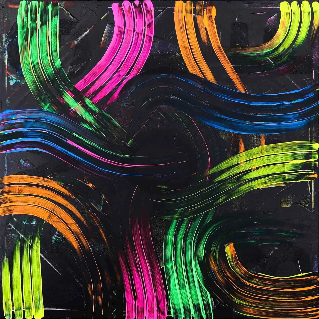
The question is not simply whether an artwork looks bright. It is how the composition creates the impression of energy. What draws your eye first? Where does the contrast become strongest? And how does the relationship between light and dark affect the overall experience?
Brightness Is Not the Same as Energy
We often associate bright colors with energetic artwork. But a painting can contain strong colors and still feel carefully balanced. The difference comes from how those colors are arranged. A small area of intense color can become a focal point. A large area of saturated color may create a completely different effect. And darker passages can give brighter elements greater visual importance. In Calina Hiriza's Innuendo, the relationship between color, composition and contrast offers another way to consider this question.
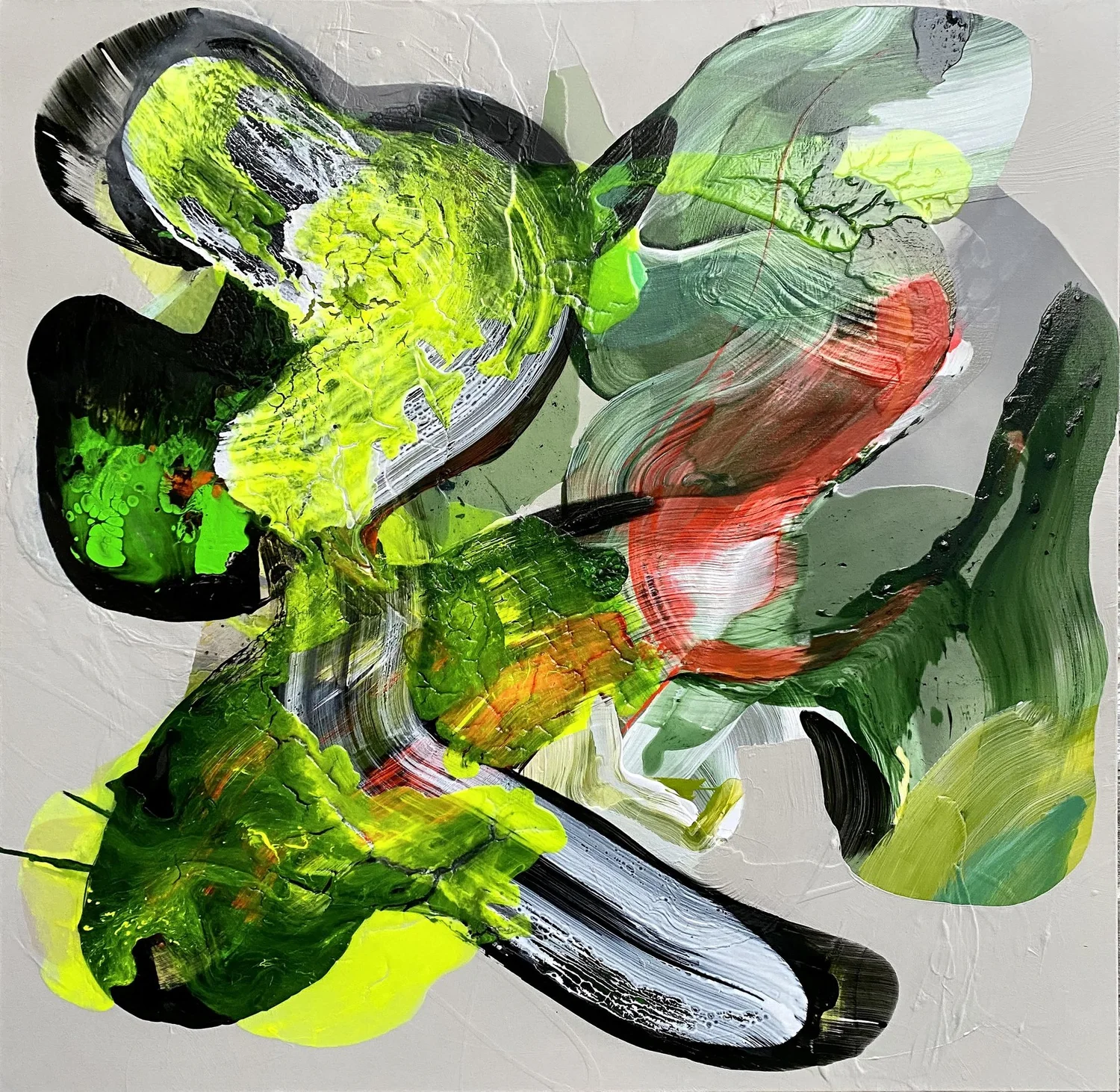
Rather than focusing only on which colors are present, look at how they interact. Does your eye move quickly across the painting? Are there quieter areas that allow you to pause? Does the composition feel controlled, spontaneous or somewhere between the two? Visual energy is not simply a matter of using brighter paint. It comes from the relationships within the work.
How Light Changes What We See
Even artworks that do not produce light can change throughout the day. Natural light is constantly shifting. A painting near a window may look different in the morning than it does late in the afternoon. Artificial lighting introduces another set of variables. A warm lamp can affect how we perceive cooler colors. A directional spotlight can emphasize particular areas of a painting. Reflective materials may reveal different details as we move around them.
The artwork remains physically the same, but our experience of it changes. This is one reason photographs are useful but imperfect substitutes for seeing original art. A photograph records an artwork under particular conditions. Living with the work means experiencing it under many different conditions.
The Power of Contrast
Sometimes the strongest impression of luminosity comes from the relationship between a bright subject and a restrained background. Daniel Pailes-Friedman's Burst 9 offers an interesting example. Pink and orange forms stand out among interwoven black, white and gray shapes. These contrasts guide the eye through the composition.
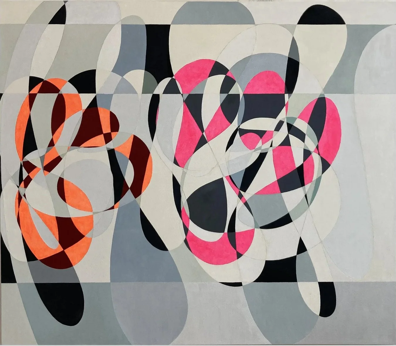
The work does not need to emit light to direct our attention. Contrast creates a focal point. This is something artists have understood for centuries, although contemporary materials and techniques offer new ways of exploring it. A bright color against a dark background can appear stronger. A metallic surface can respond to changing light. A pale form against a deep background may create a sense of illumination without any electrical component.
What we perceive as brightness is often about relationships rather than absolute intensity.
When Light Becomes Part of the Experience
There is another distinction worth considering. Some artworks are designed to be experienced differently depending on the viewer's position or the surrounding light. A reflective work may change as you move across a room. An illuminated work can affect nearby surfaces. And a work using intense contrasts can create an impression of light even when its materials remain completely static. These possibilities make the relationship between art and space especially interesting.
Embrace provides the final visual example in this discussion.
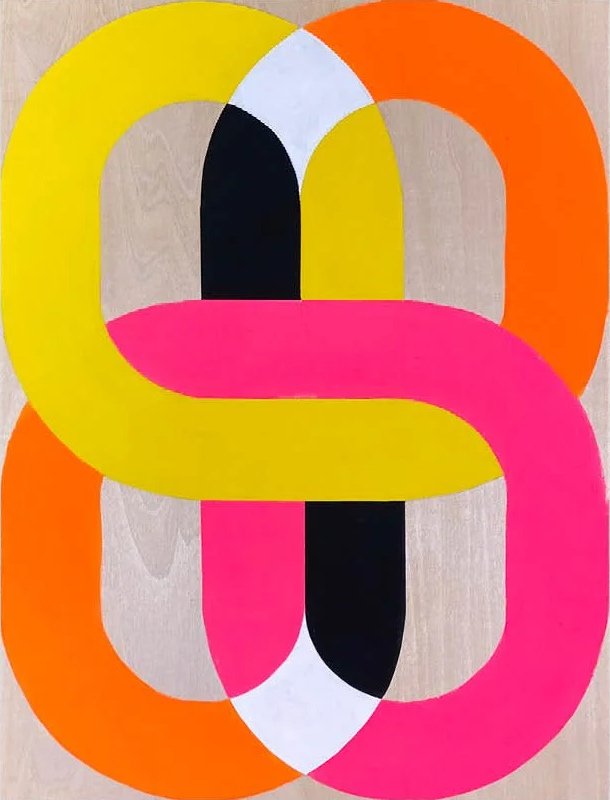
Rather than treating the artwork as an isolated image, consider its relationship with the wall, the surrounding colors and the conditions under which it is displayed. That relationship can become an important part of the experience.
Is Neon a Trend, or Something More?
Neon and fluorescent-looking colors are frequently associated with contemporary visual culture. They appear in fashion, graphic design, interiors, advertising and art. But neon is not new. Artists have explored illuminated materials for decades, using them to investigate language, perception, identity and the relationship between objects and architecture. The more interesting question is whether light or a neon-like effect adds something meaningful to the artwork. A glowing phrase can be powerful.
It can also be superficial. A painting with electric colors can hold your attention for years. Or it can lose its appeal once the initial impact fades. The material alone does not determine the value of the experience. What matters is what the artist does with it.
Living With Art That Uses Light
There are practical differences between living with a conventional painting and an illuminated artwork. An electrically illuminated piece may require access to power, installation planning and occasional maintenance. Its brightness may affect the atmosphere of a room at night. A reflective work can respond to windows, lamps and the viewer's movement. And even a conventional painting with intense color can look surprisingly different under warm and cool lighting.
These are not necessarily reasons to avoid such works. They are reasons to think about how the artwork will behave in the space where it lives. A gallery photograph can show you the composition. But the relationship between artwork, light and room becomes much more apparent when you experience the piece in person.
A Note From the Gallery
One of the things I enjoy about contemporary art is how many different ways artists can create visual impact. Sometimes it comes from color. Sometimes from contrast, reflection or the way a surface responds to light. And sometimes the artist uses light itself. I do not think an artwork becomes more interesting simply because it glows, uses neon or incorporates an unusual material. What matters is what the artist does with it.
At J. Nunez Gallery, I want people to discover works that hold their attention beyond the first impression. A bright color may be what makes you stop. But there has to be something more that makes you want to keep looking. Because the real question is not how brightly an artwork shines. It is whether there is something worth seeing when you look beyond the light.